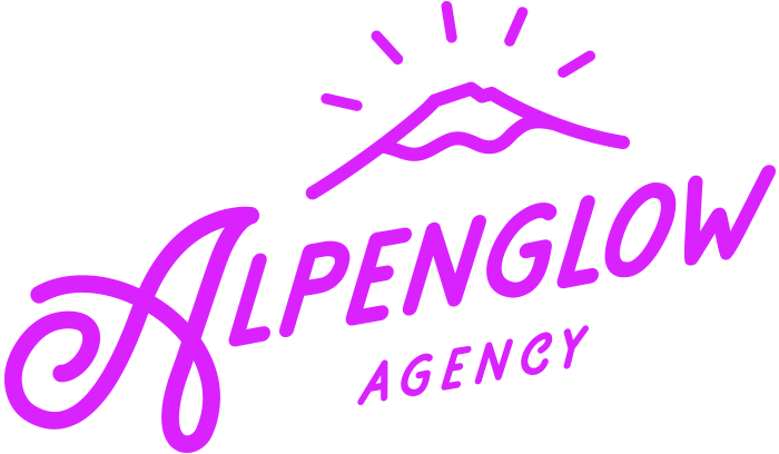
Logo
Our logo seeks to capture a "nostaligic alpine" feeling. The mountain mark was inspired by Mt. Bachelor, a stratovolcano in the Central Oregon Cascades. Our wordmark derived from western vintage typography inspired by forest and nature. Our logo was designed by the talented Hailey Skye Dehler.

Typography
We selected a font pairing that is hard working and vintage inspired.
Heading Font
"Revived, designed and released by Aaron James Draplin & Riley Cran, DDC Hardware is a straight-talkin', industrial-strength typeface in three weights and support for over 100 languages. Plus: it has tons of features including catchwords, split and stacked fractions, ordinals, and historical alternates."
- FontSeed.com
Body Font
"The old posters and signs in the traditional Montserrat neighborhood of Buenos Aires inspired Julieta Ulanovsky to design this typeface and rescue the beauty of urban typography that emerged in the first half of the twentieth century."
- Fonts.Google.com
Colors
Our basecamp of Bend, Oregon inspired our vibrant color pallet. These hues, tints, tones and shades are found along the trails, landscapes and destinations among the cascade mountains we love. Incidentally, we also think this pallet has a totally tubular 80's vibe. When it comes to the 80's, we just can't get enough...just can't get enough.

