Announcing our new brand: Alpenglow Agency!
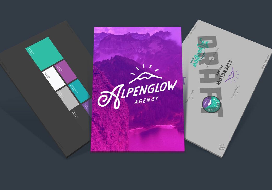
We’re thrilled to announce that as of May 5, 2020, John Moore Digital Inc. is now Alpenglow Agency! I’d like to share the rationale behind the update, and what it means for the future of the company.
A brief history
In the spring of 2016, I decided it was time to fulfill my dream of starting a digital agency. I had some exceptional clients lining up, and some of them needed immediate help. The situation was fortunate, but it didn’t leave much time to think about branding.
I jotted down “John Moore Digital Inc.” on the Articles of Incorporation and put up a one-page business card site. The name always felt like a placeholder.
I began collaborating with trusted freelancers when I needed extra help. Eventually, Jennifer Andrews, Digital Advertising Specialist, came aboard in March 2018.
We leased some office space at the OSU-Cascades innovation Co-Lab. Before long, we recruited some bright interns from the OSU-Cascades Internship program. And it’s impossible to forget our fluffy agency mascot, Banjo!
It was a metamorphosis from an individual to a team. I realized the time had come to rebrand as a team. But what to call it?
Along came a name
I started brainstorming agency names—it’s kind of like naming a band! Plenty of names surfaced like “Fiddlehead”, “Station Wagon” and “Campfire Digital”. Nothing stuck.
The right idea usually comes when I’m least expecting it. So I put the list away and trusted the universe would bring me the right name. It did!
When hiking on the big island of Hawaii, I gazed up at the volcano during sunset. The light splashed the mountainside an iridescent color. It reminded me of the Alpenglow hour we enjoy at home.
I exclaimed, “ALPENGLOW! That’s it!”
The process
Logo
We teamed up with Hailey Skye Dehler to design our new logo. She is an exceedingly talented designer, letterer, and nostalgist living in Brooklyn, NY. I’ve always admired her appreciation for vintage typography and her ability to create something new that feels like it came from another era.
We wanted something that felt vintage and outdoorsy…perhaps featuring a mountain or lettering from an Alpine town sign…
Hailey took those simple creative directions and designed some amazing versions to start:
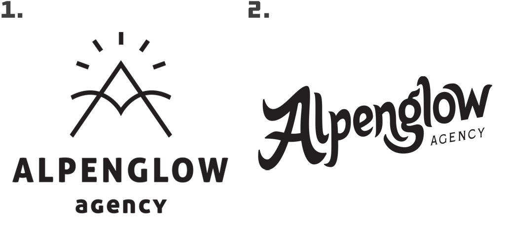
We loved the concept of the mountain and the glow marks, so it became essential to include a mountain. We reshaped the mountain using Mt. Bachelor as inspiration. Round #2 nailed the mark:
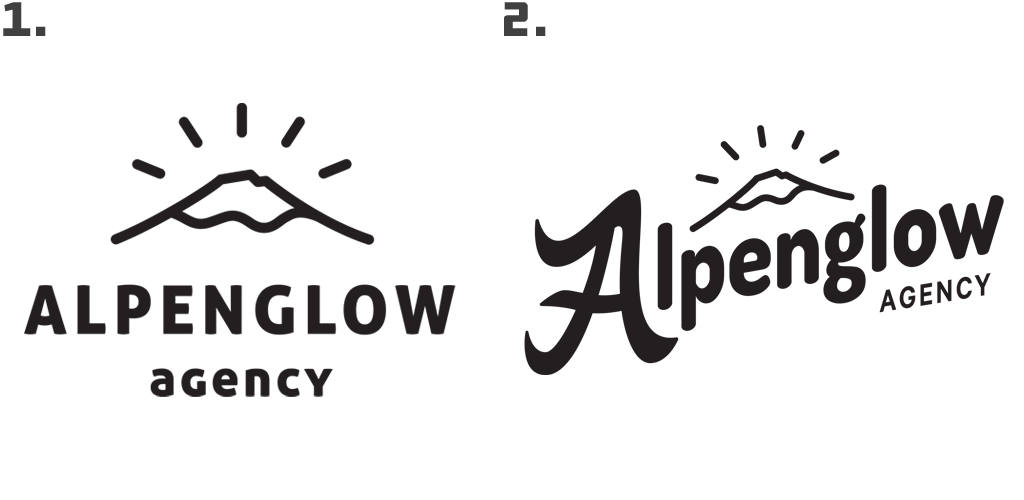
#2 was the direction we ultimately wanted. We loved the lockup and the scripted “A”, but we wanted the other letters to feel imperfect and hand created. We identified a retro font inspired by forest and nature and moved to round #3:
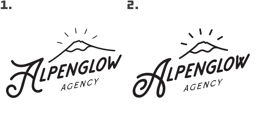
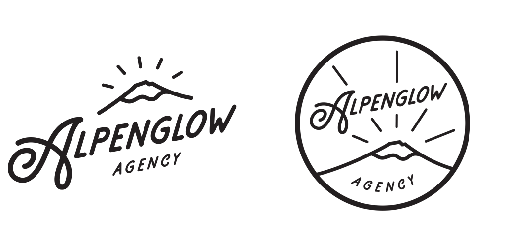
With a few small decisions and tweaks, the new logo came to fruition. Hailey included a fun “merit badge” variation appropriate for our outdoor identity. We love it!
Colors
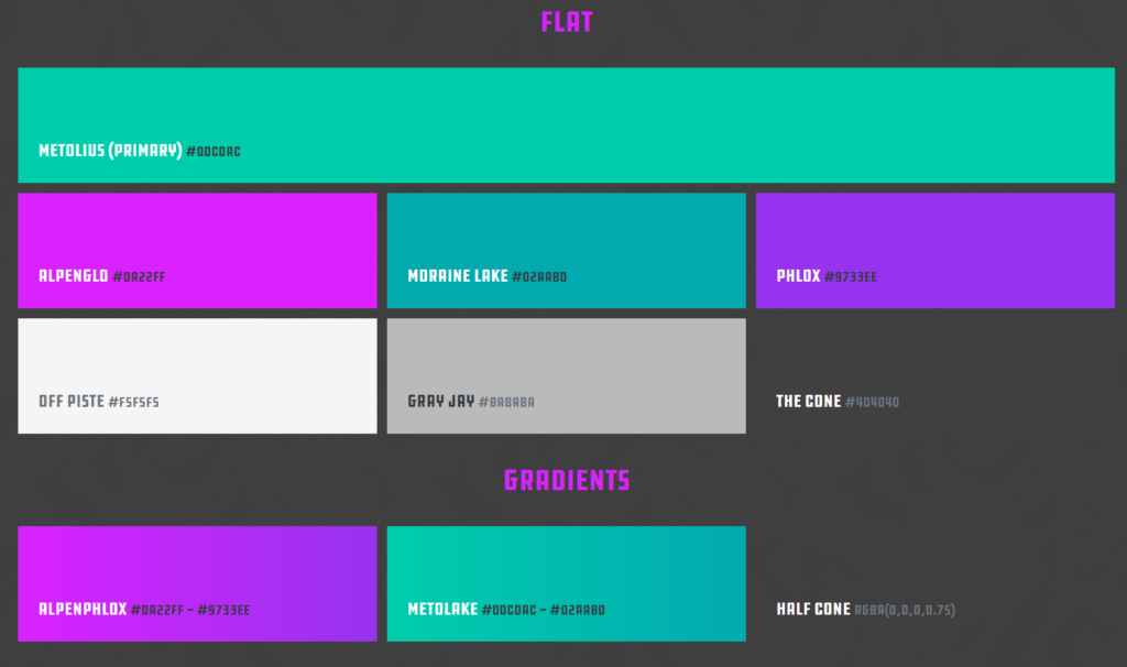
We designed a pallet inspired by colors found along the trails and landscapes of the Central Oregon Cascades. Of course, we named one color “Alpenglo” (#da22ff) in tribute to our new brand!
Typography
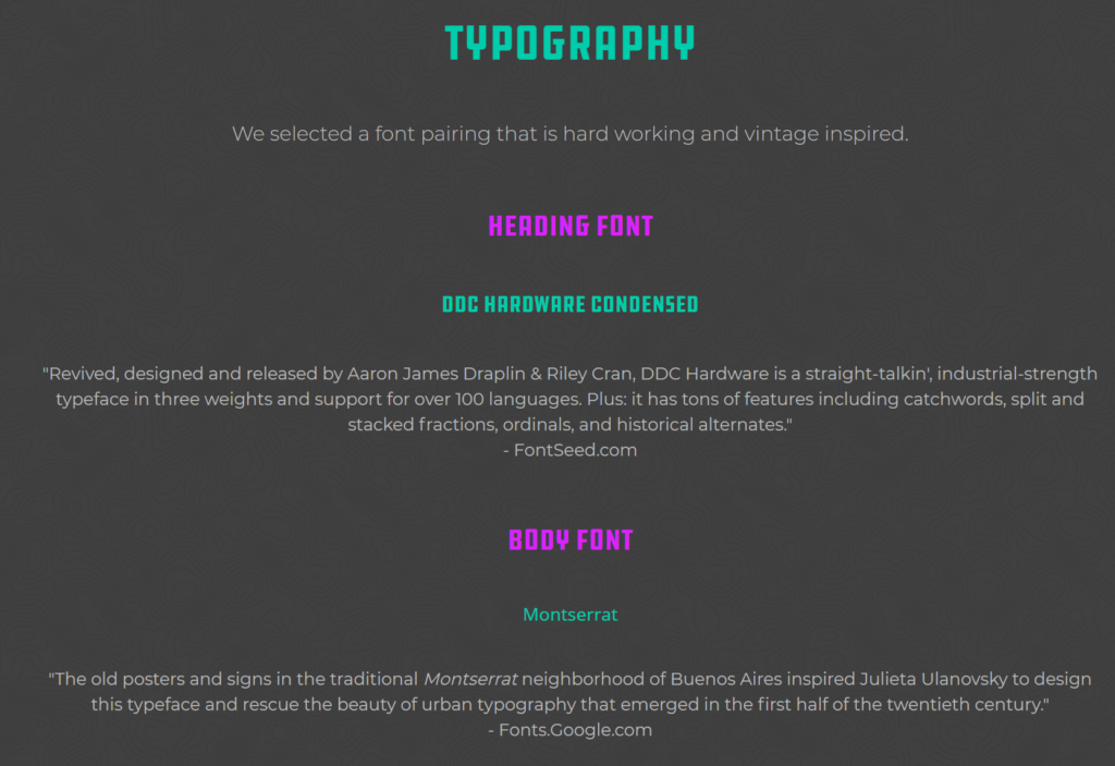
We selected “straight-talkin’, industrial-strength” DDC Hardware for headlines. It is a blue-collar type of font that works hard. It’s how we want people to think of us.
We chose Montserrat for body copy. The name literally means “Serrated Mountain.” It reminded us of Broken Top in Bend’s backyard where Alpenglow is a regular occurrence.
Where we’re headed
While we’ve updated our name and brand identity, our clients can expect the same promise we made since day #1: Above-the-clouds web design & digital advertising for exceptional companies.
The team, base-camp and services stay the same. But the new name shifts our identity from an individual to a team. Our goal is to grow our business and play on a larger field. Alpenglow Agency will help us do that.

